 Starting up a new website is a mammoth task. You have to think about what you actually want to achieve and how best to go about it. The internet is so vast now that it’s no longer sufficient to just have a bit of information on a page and go from there. Naturally, you can decide to hire a web designer to help you create your page, but he or she will probably want to know a bit about what your intentions are as well. Hopefully, therefore, the following examples of excellent website design from around the world will help you get some inspiration.
Roll Studio
Roll Studio is a gorgeous website that has been recognized for excellent design, fantastic usability, great creativity and superb content. They received an honorable mention and a SOTD award.
The website is fast, external assets are minified and the content is still available with disabled javascript.
It was very important for this particular website to win an award, since their focus is on website design. One good way to find a designer, if you want to outsource this, is by looking at what they have done with their own website. If you find a design company and you think their own website is nothing to write home about, then you should avoid working with them.
This Is Your Kingdom
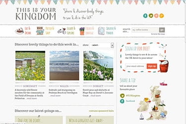
 This Is Your Kingdom is a WordPress website, which makes it very important to recognize. This is because almost all newly started sites these days are WordPress sites, which means that getting inspiration from these sources is really important. One of the things that makes this so special is the intricate yet simplistic design.
Simple in its concept, the site is much more complex when we start to consider all of its inner workings and potential. Designed by Katie Marcus, and robustly developed by Kim Lawler, the site is built to handle growing levels of content.
The site is a perfect example of companies that understand their current position, but are ready to take on exponential growth as and when it happens. Too many sites these days only focus on the present. If the company then grows, they have to move their site over because their host is unable to accommodate. Other businesses shrink, which means the website itself is left to look really poor. This Is Your Kingdom is a perfect example of a design that can grow or shrink according to the needs of the company.
FreshBooks
 FreshBooks is a huge website that is used by millions of people around the world. One of the reasons why this one is recognized for being one of the best of the best is because it literally ticks all the boxes. All the elements of a good website are included, not in the least the fact that it quickly demonstrates who FreshBooks are and what they do.
If visitors can’t identify what it is you do within seconds, they won’t stick around long.
They also have been able to identify their target audience, which is young online professionals, and made the site attractive to them. They immediately demonstrate how they offer value for money, which is what attracts a great deal of organic traffic. The site is easy to use and doesn’t provide superfluous information. Instead, they have clear calls for action that anyone can follow. Another interesting point is that the site isn’t stagnant. The design and layout and the information is frequently changed so that it’s always up-to-date. Finally, the overall design, fonts and colors are absolutely amazing. This allows FreshBooks to create a true brand image.


