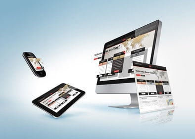
A good website should include design features that are in line with modern trends. No matter what type of website you have, including stylish looking features that not only add to the functionality of the website but also to the aesthetics, should be considered. There are many different modern web design trends that you can take advantage of.
Larger Font Sizes
 During the first decade of the internet the font size most commonly used was 12pt. However, nowadays there are two reasons to have a larger font size. Firstly, screens are getting smaller and smaller which means that small font sizes are harder to read. Secondly, mobile traffic is increasing year after year and that means you need to take the need to optimize for mobile phones seriously. Reading small font sizes on mobiles can be difficult and for that reason an increase in font size will not make your mobile visitors leave your site out of frustration. A font size of 14-16pt should be used to make it easier for your users. Furthermore, today we have many font types to choose from that you will see good quality websites making use of. An easy way to browse fonts and add them to your site is by using Google fonts. You can simply add a link to the font type hosted by Google to use it directly in your site design.
Parallax Scrolling
In 2013, parallax scrolling became a hit. This feature involves the moving of element on a page vertically or horizontally as you scroll, and in the process a lot of information can be conveyed to the user with a 3d type effect. Hence this allows any products or services to be shown off to the visitor using visual aids, creating interest and depth to a design.
The nature of parallax scrolling means it’s an interactive design feature where your visitors get a say on when and how fast the elements will move across their screens. You could show off your products through a story, which in some cases might be more effective than having a traditional word written sales copy.
The Flat Design
You may see a lot of the more authoritative websites on the internet becoming simpler in design, and there is a reason for this, which is that the simple design provides better performance. Page load times are one of the key metrics for determining user satisfaction when browsing a website. The less clutter you have on your website the smaller the file sizes your web pages will have, and that leads to shorter load times. Furthermore, less clutter allows the user to quickly access all of the information on the page, whereas if a page is cluttered then they will have a hard time concentrating on the important parts of the page.
Lastly, if you’re not going to create a mobile version of your website then at least going with a fluid responsive design will be hugely beneficial. Mobile phone users require websites to be simple in order to have an easy time navigating them. A flat and responsive design will provide this, and with it your mobile visitors will enjoy using your website.
Infographics
End users are taking a real liking to info-graphics because they can convey complicated information in a manner that is simple to understand, and more importantly, much more quickly. Internet users have short attention spans and for that reason the faster you’re able to convey the idea or the benefits of a product or service the better off you will be. Moreover, info-graphics don’t take a lot of screen space in order to convey a significant amount of information.
These are just some of the design features that are increasing in popularity, keep your eye out for more as without a doubt there will be more website design features that you need to take advantage of as technology advances and the landscape of the internet has changed.


